Technical
Relative Sizes and Aspect Ratio
For a printed medium, advertisement sizes are expressed mm or cm. On screen, this would make no sense as there is no control over the screen size or degree of magnification being used by a viewer.
The important factors are:
- Relative Size, the relationship between the sizes of the advertisements,
- Aspect Ratio, the relationship between the width and the height of an image.
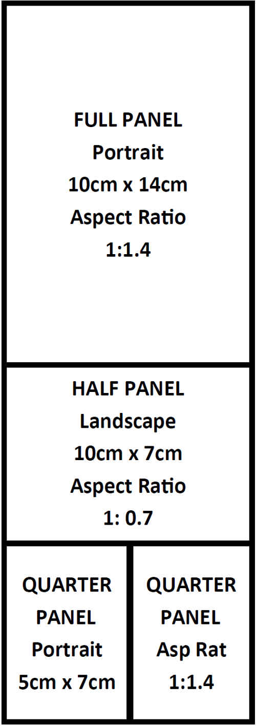
The sizes offered by Organists Online are: Full Panel, Half Panel, and Quarter Panel (see below for a diagram), with the following aspect ratios:
- Full Panel: portrait (tall and narrow) [width followed by depth] 1 : 1.4
- Half Panel: landscape (short and wide) [width followed by depth] 1 : 0.7
- Quarter Panel: portrait (tall and narrow) [width followed by depth] 1 : 1.4
Just in case this seems a bit mathematical, here is the same information expressed in cm.
- Full Panel: portrait (tall and narrow) [width followed by depth] 10cm : 14cm
- Half Panel: landscape (short and wide) [width followed by depth] 10cm : 7cm
- Quarter Panel: portrait (tall and narrow) [width followed by depth] 5cm : 7cm
Please remember that, for the reasons given above, these are not actual sizes, they just represent the relationship between the width and the height. However, if you are
designing an advert they can be used to form a template.

RETURN TO:
Top
Menu - Advertising Pages
Menu - Organists Online
Screen Resolution
This determines how much information you can get in a space. Normal, quality magazines print at a resolution of at least 300 dots per inch (dpi). That is, each dot or pixel is 1/300 of an inch across.
This means that you can get a lot of detailed information or print into a small space. Many computer screens only have a resolution of 96dpi, and some a low as 72dpi.
The result is that the amount of information that can clearly and readably be placed in a space on a screen may be as little as 5% the amount that could go into a printed area of the same size.
In other words, advertisements intended for computer screen need to be simple, to the point, and in large type. If you refer back to the top tier of THIS, you can see what I mean.
The quarter panel adverts in the middle tier are taken
from actual printed handbills, designed at 300dpi. It quite obvious that much important detail has been lost and much text is illegible. No matter how much you zoom the image, the text will just become fuzzy.
On the other hand, the adverts in the top tier were designed for computer use. They are direct and bold. They may not contain much information but this doesn't matter as, in their actual location, they link
through to fully informational websites. The important thing is that they catch the eye, and can be read without difficulty in about two seconds. Via this LINK you can see actual ads, in place, and linked through
to their own websites.
RETURN TO:
Top
Menu - Advertising Pages
Menu - Organists Online
Formats
This refers to the app, programme, package or file-type in which the advertisement is put together. The most common are JPG, GIF, PNG
(if the advert is designed just as an image), or Microsoft Word, Publisher, PowerPoint (if the advert is part of a document).
However, please note:
- If you send it as a JPG, GIF or PNG, it's certain that every detail of your advert will be accurately reproduced on the screen.
- If you send it as a PDF with embedded fonts, all should be fine. (Your PDF package Help facility should be able to tell you how to embed fonts.)
- If you send it as a PDF, without embedded fonts, and you have used a font not on our computer, a substitution automatically happens and you may not get what you were expecting.
- If you send it as a Microsoft Publisher, Word, or PowerPoint file and it's a different version to what we have here, the appearance could be very different.
- If you send it in some format unknown to our computer, nothing will happen as we won't be able to process it.
RETURN TO:
Top
Menu - Advertising Pages
Menu - Organists Online